MINIMUM
A San Francisco Typeface
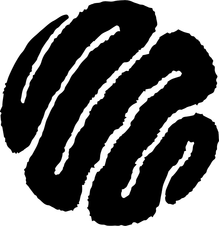
This year, ~’ve been exploring the concept of my marks living inside a square as opposed to forming the square. ~ liked it so much that ~ wanted to challenge myself to make an alphabet using a similar philosophy. Now ~’ve turned it into a font.
The goal was to make each letter just legible enough to read. The less noise, the better. The letters, like the art, resemble marks contained within an invisible square frame.

After a few versions, ~ unlocked the second level to it. Because they’re so boxy and heavy, warping the letters unlocks entirely new directions. They can stack like tiles or take fluid shapes like the work of Wes Wilson

Wes Wilson, legend, designed posters for Bill Graham concerts in the late 60’s. His work played a big role in establishing the psychedelic letter style we associate with that era.
Given the history, it only felt right making this font here in San Francisco as well.

